[스나이퍼팩토리] 한컴AI 2기 - 교육 6주차 후기
Expo 기반 React Native 포켓몬 도감 앱 개발
2025. 8. 4. ~ 2025. 8. 8.
이번 주차에는 Expo와 TypeScript 기반으로 간단한 포켓몬 도감 앱을 개발하였습니다.
프로젝트 구조 및 내비게이션
React Native 에서는 expo-router 를 활용하여 앱의 전반적인 내비게이션과 레이아웃을 관리할 수 있습니다.
루트 레이아웃
앱의 최상위 레이아웃은 ThemeProvider 를 사용하여 앱 전체에 공통적인 테마를 적용하고, 외부 폰트를 불러옵니다. 해당 프로젝트에서는 도트 분위기에 맞게 DungGeunMo 폰트를 사용하였으며, 폰트 로딩이 완료될 때까지는 앱이 렌더링되지 않도록 하였습니다.
1
2
3
4
5
6
7
8
9
10
11
12
13
14
15
16
17
18
19
20
21
22
23
24
25
26
27
28
29
...

import './global.css';

const appTheme = {
  ...DefaultTheme,
  colors: {
    ...DefaultTheme.colors,
    primary: '#121212',
    background: '#f9f9f9',
  },
};

export default function RootLayout() {
  const [fontsLoaded] = useFonts({
    DungGeunMo: require('../assets/fonts/DungGeunMo.otf'),
  });

  // 폰트 로딩이 되지 않을 경우 렌더링 X.
  if (!fontsLoaded) return null;

  return (
    <ThemeProvider value={appTheme}>
      <SafeAreaView style={{ flex: 1 }}>
        <Slot />
      </SafeAreaView>
    </ThemeProvider>
  );
}
루트 레이아웃은 SafeAreaView 로 감싸져 있어, 노치나 상태 바와 같은 디바이스별 UI 요소에 의해 앱 콘텐츠가 가려지지 않도록 하였습니다. 또한 global.css 파일을 import 하여, React Native 내에서 Tailwind CSS를 사용할 수 있도록 하였습니다.
탭 레이아웃
앱의 주요 화면들은 하단 탭 내비게이션을 통해 접근할 수 있도록 구성되어 있습니다. 총 다섯 개의 탭이 있으며, 각각 홈, 도감, 랭킹, 대시보드, 프로필 화면으로 이동합니다. 각 탭은 lucide-react-native 아이콘 라이브러리를 사용하여 시각적으로 구분됩니다.
 앱 하단 탭 내비게이션
다만 이번 주차에는 시간 관계상 홈 탭만 구성되었습니다.
1
2
3
4
5
6
7
8
9
10
11
12
13
14
15
16
17
18
19
20
21
22
23
24
25
26
27
28
29
30
31
export default function TabsLayout() {
  return (
    <Tabs
      screenOptions={{
        headerShown: false, // 헤더 숨김
        tabBarStyle: {
          height: 60,
          paddingTop: 4,
          paddingBottom: 4,
        },
        tabBarLabelStyle: { marginTop: 2 },
      }}
    >
      <Tabs.Screen
        name="index"
        options={{
          title: '홈',
          tabBarIcon: ({ color }) => (<HomeIcon size={24} color={color} />),
        }}
      />
      <Tabs.Screen
        name="pokedex"
        options={{
          title: '도감',
          tabBarIcon: ({ color }) => (<BookMarkedIcon size={24} color={color} />),
        }}
      />
      {/* ... (rank, dashboard, profile 탭도 유사하게 정의됨) */}
    </Tabs>
  );
}
screenOptions 에서 headerShown: false 옵션을 적용해 각 화면의 기본 헤더를 숨기고, 필요에 따라 커스텀 헤더를 사용할 수 있도록 하였습니다.
PokeText
앞에서 언급된 DungGeunMo 폰트가 적용된 텍스트 컴포넌트 입니다. react-native 의 Text 컴포넌트를 래핑하여, 폰트가 적용된 텍스트 컴포넌트를 사용할 때 마다 일일이 fontFamily 스타일 속성을 정의할 필요가 없어져 매우 편리하게 사용할 수 있었습니다.
1
2
3
4
5
6
7
import { Text, type TextProps } from 'react-native';

export function PokeText(props: TextProps) {
  return (
    <Text {...props} style={[{ fontFamily: 'DungGeunMo' }, props.style]} />
  );
}
PokemonTypeBadge
포켓몬의 타입을 시각적으로 나타내는 배지 컴포넌트입니다. 각 타입에 따라 다른 배경색, 텍스트 색을 가집니다. 타입별 색상 정보는 src/constants/colors.ts 파일에 정의하여 관리하였습니다.
1
2
3
4
5
6
7
8
9
10
11
12
13
14
15
16
17
18
19
20
21
22
interface PokemonTypeBadgeProps {
  type: {
    name: string;
    koreanName: string;
  };
}

export function PokemonTypeBadge({ type }: PokemonTypeBadgeProps) {
  const colors =
    pokemonTypeColors[type.name.toLowerCase()] || pokemonTypeColors.default; // 타입에 따른 색상 선택

  return (
    <View
      className="px-3 py-[6px] rounded-md"
      style={{ backgroundColor: colors.background }} // 배경색 적용
    >
      <PokeText className="text-sm font-semibold" style={{ color: colors.text }}> // 텍스트색 적용
        {type.koreanName}
      </PokeText>
    </View>
  );
}
pokemonTypeColors 객체는 normal, fire, water 등 다양한 포켓몬 타입에 대한 배경색과 텍스트 색상을 포함하며, 정의되지 않은 타입에 대한 default 값도 제공합니다.
1
2
3
4
5
6
7
8
9
10
11
export const pokemonTypeColors: {
    [key: string]: { background: string; text: string };
} = {
    normal: { background: '#f5f5f5', text: '#a3a3a3' }, // neutral-100, neutral-400
    fire: { background: '#ffe4e6', text: '#fb7185' }, // rose-100, rose-400

    ...

    // 정의되지 않은 타입이 들어올 경우를 대비한 기본값
    default: { background: '#e0e0e0', text: '#555' },
};
PokemonCard
개별 포켓몬의 정보를 표시하는 카드 컴포넌트입니다. API 를 통해 포켓몬 데이터를 비동기적으로 가져오고, 로딩 및 오류 상태를 처리하며, 터치 시 포켓몬 상세 모달을 띄우는 역할을 합니다.
1
2
3
4
5
6
7
8
9
10
11
12
13
14
15
16
17
18
19
20
21
22
23
24
25
26
27
28
29
30
31
32
33
34
35
36
37
38
39
40
41
42
43
44
45
46
47
48
49
50
51
52
53
54
55
56
57
58
59
60
61
62
63
64
65
66
67
68
interface PokemonCardProps {
  number: number; // 포켓몬 번호
}

export function PokemonCard({ number }: PokemonCardCardProps) {
  const [modalVisible, setModalVisible] = useState(false);
  const [loading, setLoading] = useState(true);
  const [error, setError] = useState(false);
  const [pokemon, setPokemon] = useState(null);

  useEffect(() => {
    const fetchInitialData = async () => {
      const data = await getPokemonData(number); // 포켓몬 데이터 가져오기
      if (data) setPokemon(data);
      else setError(true);
      setLoading(false);
    };
    fetchInitialData();
  }, []);

  if (loading) {
    return (
      <ActivityIndicator size="large" className="flex-1 items-center justify-center" />
    );
  }

  if (error || !pokemon) {
    return (
      <PokeText className="flex-1 text-center text-red-500">
        데이터를 불러오는 데 실패했습니다.
      </PokeText>
    );
  }

  return (
    <Pressable
      className="flex-1 p-4 bg-white border rounded-2xl elevation-sm"
      onPress={() => setModalVisible(!modalVisible)} // 모달 토글
    >
      {/* 포켓몬 타입 배지들 렌더링 */}
      {pokemon.types.map((type) => (
        <PokemonTypeBadge key={generateUUIDv4()} type={type.type} />
      ))}
      {/* 포켓몬 이미지 */}
      <Image
        source={{ uri: `https://raw.githubusercontent.com/PokeAPI/sprites/master/sprites/pokemon/${pokemon.id}.png` }}
        className="w-full aspect-square object-contain"
      />
      {/* 포켓몬 이름 (한글 이름, 영어 이름) */}
      <PokeText className="text-xl font-semibold text-neutral-800">
        {pokemon.koreanName}
      </PokeText>
      <PokeText className="text-sm font-light text-neutral-400">
        {pokemon.name}
      </PokeText>
      <PokeText className="text-sm font-light text-neutral-400">
        0 owned
      </PokeText>

      {/* 포켓몬 상세 모달 */}
      <PokemonDetailModal
        pokemon={pokemon}
        visible={modalVisible}
        onClose={() => setModalVisible(false)}
      />
    </Pressable>
  );
}
useEffect 훅을 사용하여 컴포넌트 마운트 시 getPokemonData 함수를 호출하여 포켓몬 데이터를 가져옵니다. 데이터를 가져오는 동안에는(loading === true) ActivityIndicator 를 표시하고, 실패 시에는 오류 메시지를 렌더링합니다.
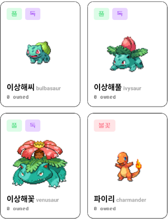 각 컴포넌트가 적용된 포켓몬 카드 리스트 예시
PokemonDetailModal
PokemonCard 에서 터치 시 나타나는 모달 컴포넌트입니다. 선택된 포켓몬의 상세 정보 및 버튼 컴포넌트를 포함합니다.
1
2
3
4
5
6
7
8
9
10
11
12
13
14
15
16
17
18
19
20
21
22
23
24
25
26
27
28
29
30
31
32
33
34
35
36
37
38
39
40
41
42
43
44
45
46
47
48
49
50
51
52
53
54
55
56
57
58
59
60
61
62
63
64
65
66
67
interface PokemonDetailModalProps {
  pokemon: Pokemon | null;
  visible: boolean;
  onClose: () => void;
}

export default function PokemonDetailModal({
  pokemon,
  visible,
  onClose,
}: PokemonDetailModalProps) {
  if (!pokemon) return null;

  return (
    <Modal
      animationType="fade"
      transparent={true}
      visible={visible}
      onRequestClose={onClose}
    >
      <SafeAreaView className="flex-1 justify-center items-center bg-black/40">
        <View className="w-[90%] bg-white p-6 rounded-3xl items-center gap-4">
          <Image
            source={{ uri: `https://raw.githubusercontent.com/PokeAPI/sprites/master/sprites/pokemon/${pokemon.id}.png` }}
            className="w-2/5 aspect-square object-contain border"
          />
          <PokeText className="text-3xl font-bold text-neutral-800">
            {pokemon.koreanName}
          </PokeText>
          <View className="flex-row gap-2">
            {pokemon.types.map((type) => (
              <PokemonTypeBadge key={generateUUIDv4()} type={type.type} />
            ))}
          </View>
          {/* 포켓몬 세부 정보 (높이, 무게 등) */}
          <PokeText>HEIGHT</PokeText>
          <PokeText>{pokemon.height / 10} m</PokeText>
          <PokeText>WEIGHT</PokeText>
          <PokeText>{pokemon.weight / 10} kg</PokeText>

          {/* 포획 버튼 */}
          <Pressable
            className="flex-1 flex-row items-center justify-center gap-2 bg-amber-200 py-3 px-6 rounded-lg"
            onPress={() => alert('포획 버튼을 클릭하였습니다.')} // 포획 버튼 클릭 시 알림
          >
            <Image
              source={require('@/assets/images/pokeball.png')}
              className="w-6 aspect-square"
            />
            <PokeText className="text-xl font-bold text-amber-800">
              Catch !!
            </PokeText>
          </Pressable>
          {/* 닫기 버튼 */}
          <Pressable
            className="bg-neutral-200 py-4 px-6 rounded-lg"
            onPress={onClose}
          >
            <PokeText className="text-neutral-500 font-semibold">
              Close
            </PokeText>
          </Pressable>
        </View>
      </SafeAreaView>
    </Modal>
  );
}
모달은 포켓몬의 한글 이름, 타입 배지, 높이, 무게 등의 정보를 표시합니다. Catch !! 버튼 터치 시 간단한 알림이 뜹니다.
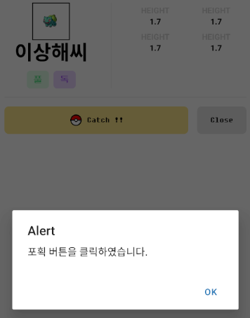 포켓몬 상세 모달 예시
데이터 처리 및 API 연동
getPokemonData
이 비동기 함수는 axios 를 사용하여 PokeAPI 에서 포켓몬 데이터를 가져옵니다. 단순히 기본 데이터를 가져오는 것을 넘어, pokemon-species 엔드포인트에서 포켓몬의 한글 이름을 가져오고, 각 타입의 url 을 통해 타입의 한글 이름까지 가져와서 데이터에 추가합니다.
1
2
3
4
5
6
7
8
9
10
11
12
13
14
15
16
17
18
19
20
21
22
23
24
25
26
27
28
export async function getPokemonData(id: number): Promise<Pokemon | null> {
  try {
    const resPokemon = await axios.get(`https://pokeapi.co/api/v2/pokemon/${id}`);
    const data: Pokemon = resPokemon.data;

    // 포켓몬 한글 이름 가져오기
    const resSpecies = await axios.get(`https://pokeapi.co/api/v2/pokemon-species/${id}`);
    const koreanName = (resSpecies.data.names as any[])
      .filter((obj: any) => obj.language.name === 'ko')
      .map((obj: any) => obj.name);
    if (koreanName.length > 0) data.koreanName = koreanName;

    // 각 타입의 한글 이름 가져오기
    for (let i = 0; i < data.types.length; i++) {
      const resType = await axios.get(data.types[i].type.url);
      const koreanType = (resType.data.names as any[])
        .filter((obj: any) => obj.language.name === 'ko')
        .map((obj: any) => obj.name);
      if (koreanType.length > 0)
        data.types[i].type.koreanName = koreanType;
    }

    return data;
  } catch (e) {
    console.error('Error fetching Pokémon data:', e);
    return null;
  }
}
Pokemon 인터페이스
가져온 포켓몬 데이터의 구조를 정의하는 인터페이스입니다. koreanName, koreanGenus, 그리고 각 type 객체 내의 koreanName 필드를 포함하여, 한글화된 데이터를 효과적으로 관리할 수 있도록 설계되었습니다.
1
2
3
4
5
6
7
8
9
10
11
12
13
14
15
16
17
18
19
20
21
22
23
24
25
26
export interface Pokemon {
  id: number;
  name: string;
  koreanName: string; // 한글 이름
  sprites: { front_default: string };
  genus: string;
  koreanGenus: string;
  height: number;
  weight: number;
  types: {
    slot: number;
    type: {
      url: string;
      name: string;
      koreanName: string; // 타입의 한글 이름
    };
  }[];
  abilities: {
    slot: number;
    ability: {
      url: string;
      name: string;
      koreanName: string;
    };
  }[];
}
이 인터페이스를 통해 앱 내에서 포켓몬 데이터를 다룰 때 타입 안정성을 보장할 수 있었습니다.
마무리
이번 포켓몬 도감 애플리케이션은 Expo, React Native, TypeScript 를 기반으로 할 수 있는 간단하고 좋은 프로젝트였던 것 같습니다. 깔끔한 컴포넌트 구조, 효율적인 데이터 처리 (특히 한글화 데이터), 그리고 사용자 친화적인 내비게이션 및 UI 요소를 통해 어떻게 해야 사용자에게 좋은 경험을 제공할 수 있는 지를 파악할 수 있었습니다.
본 후기는 [한글과컴퓨터x한국생산성본부x스나이퍼팩토리] 한컴 AI 아카데미 2기 (B-log) 리뷰로 작성 되었습니다.
#한컴AI아카데미2기 #AI개발자 #AI개발자교육 #한글과컴퓨터 #한국생산성본부 #스나이퍼팩토리 #부트캠프 #AI전문가양성 #개발자교육 #개발자취업